The project focused on understanding where users experience friction, what they need at different stages of the journey, and how the experience could become more intuitive and trustworthy.
01 — DiscoverThe Problem
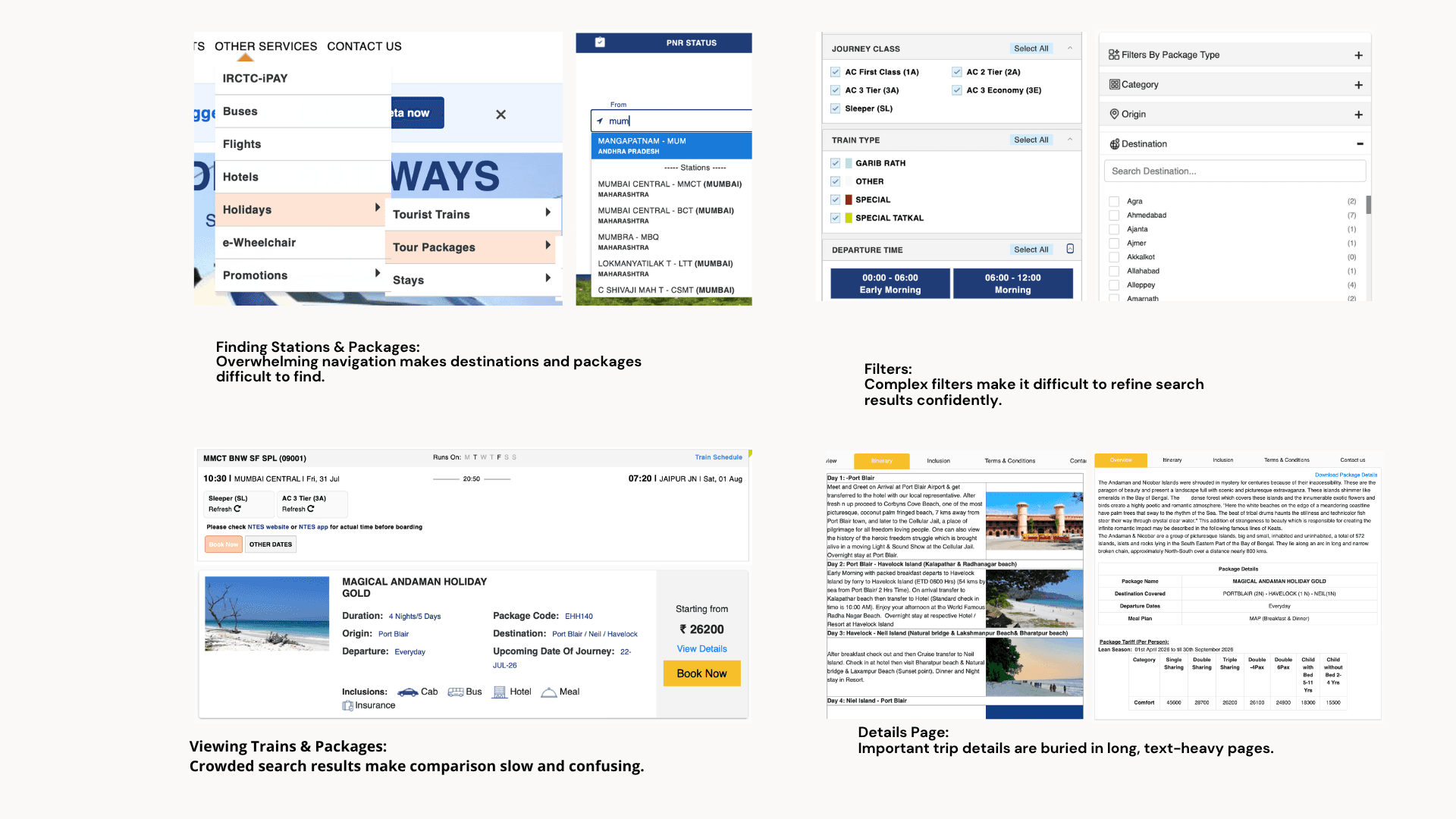
IRCTC offers many services within one platform, but users can encounter friction while completing basic travel tasks.
The initial exploration revealed issues around:
Complex login and authentication
Difficulty finding and comparing trains
Confusing filters
Information-heavy screens
Unclear payment and cancellation information
Difficulty tracking trains and refunds
Poor discoverability of tourism packages
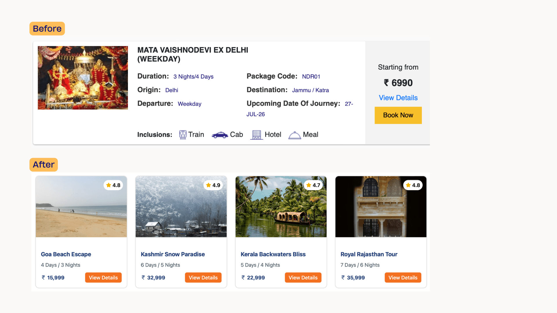
Limited visual communication for package information
Lack of flexibility and personalization
Instead of immediately redesigning the interface, we first mapped the existing experience to understand where and why these problems occur.
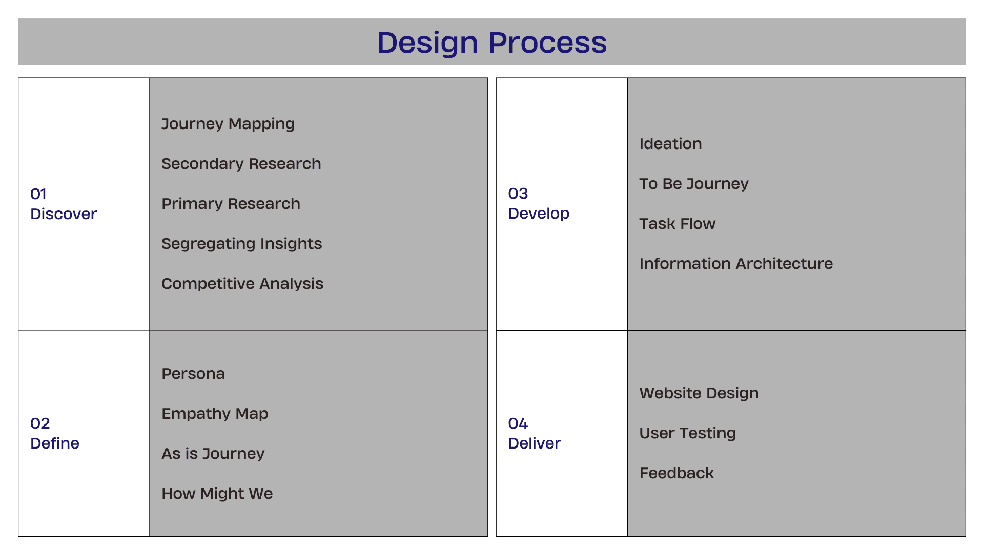
Research Approach
We used a combination of qualitative and evaluative research methods.
Research methods
Secondary Research
Studied the existing IRCTC website and booking flows
Reviewed the structure and information presented at different stages
Identified recurring usability and navigation issues
Primary Research
Gathered user perspectives around train booking and travel planning
Explored expectations, frustrations, motivations and behaviours
Used these findings to build user personas and empathy maps.

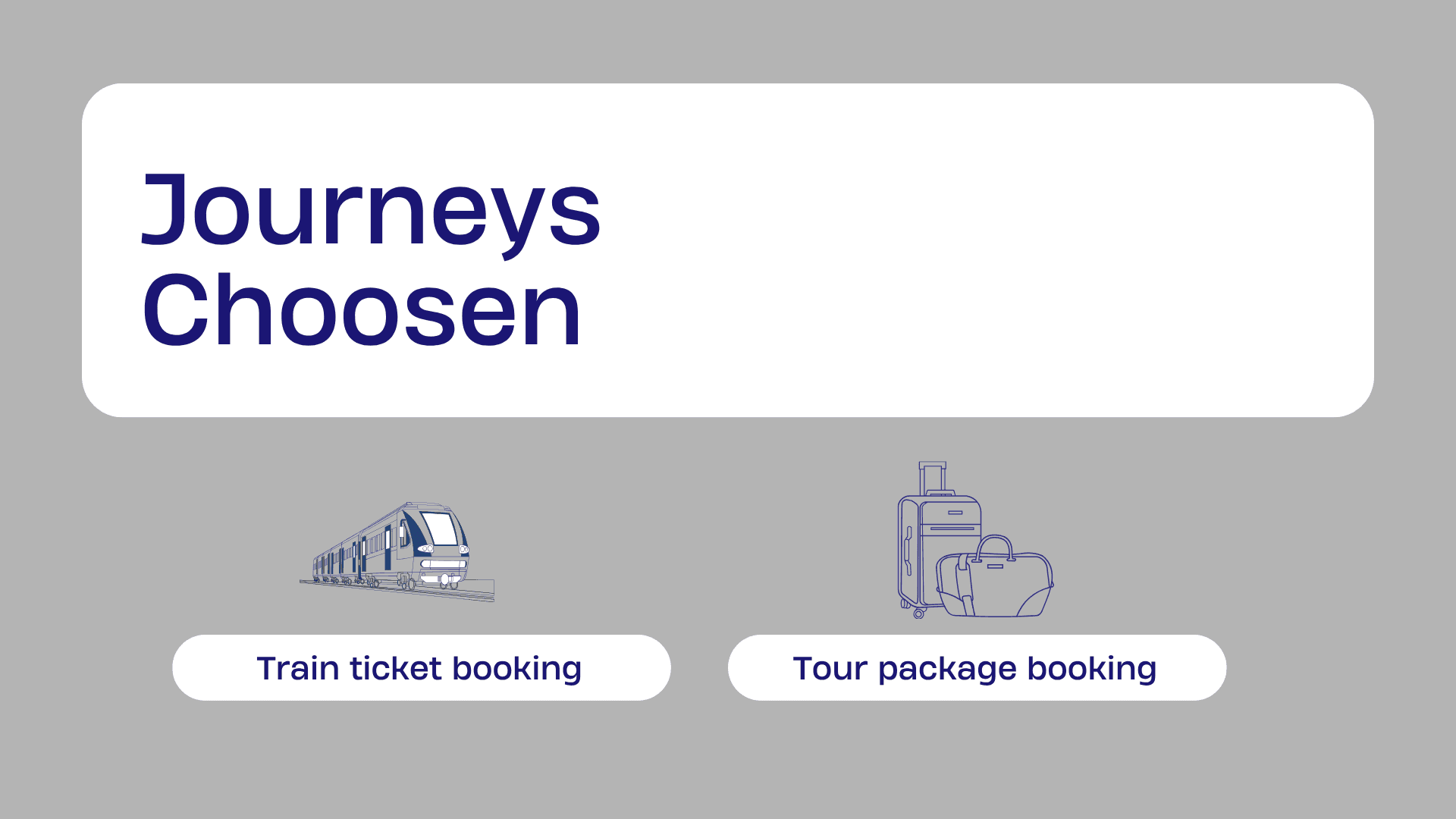
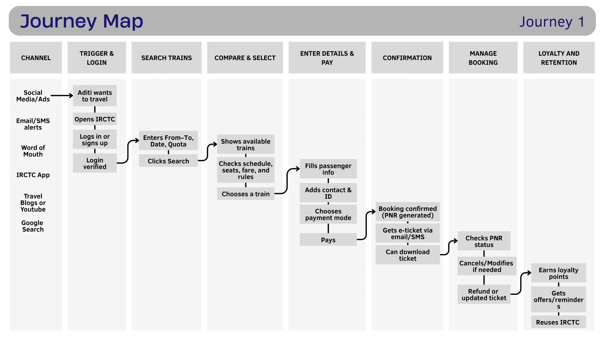
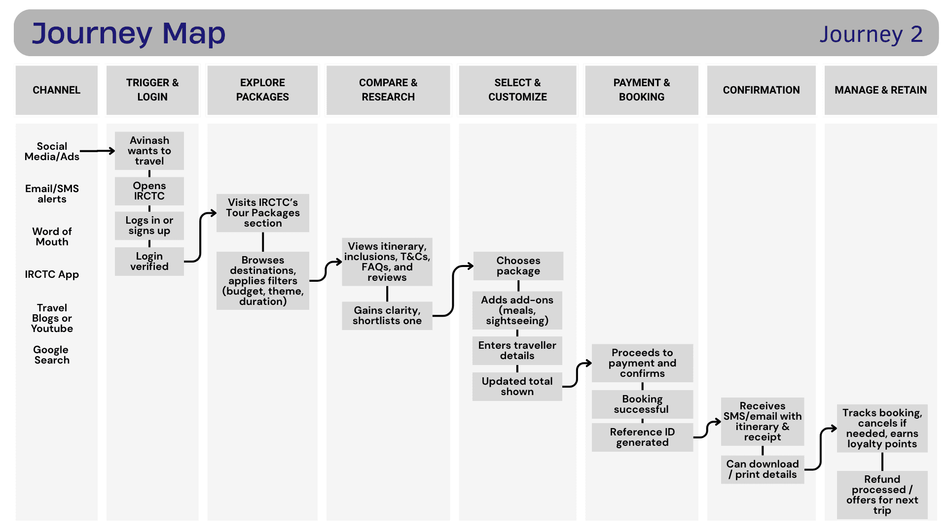
Journey Mapping
Mapped the complete experience instead of evaluating individual screens in isolation.
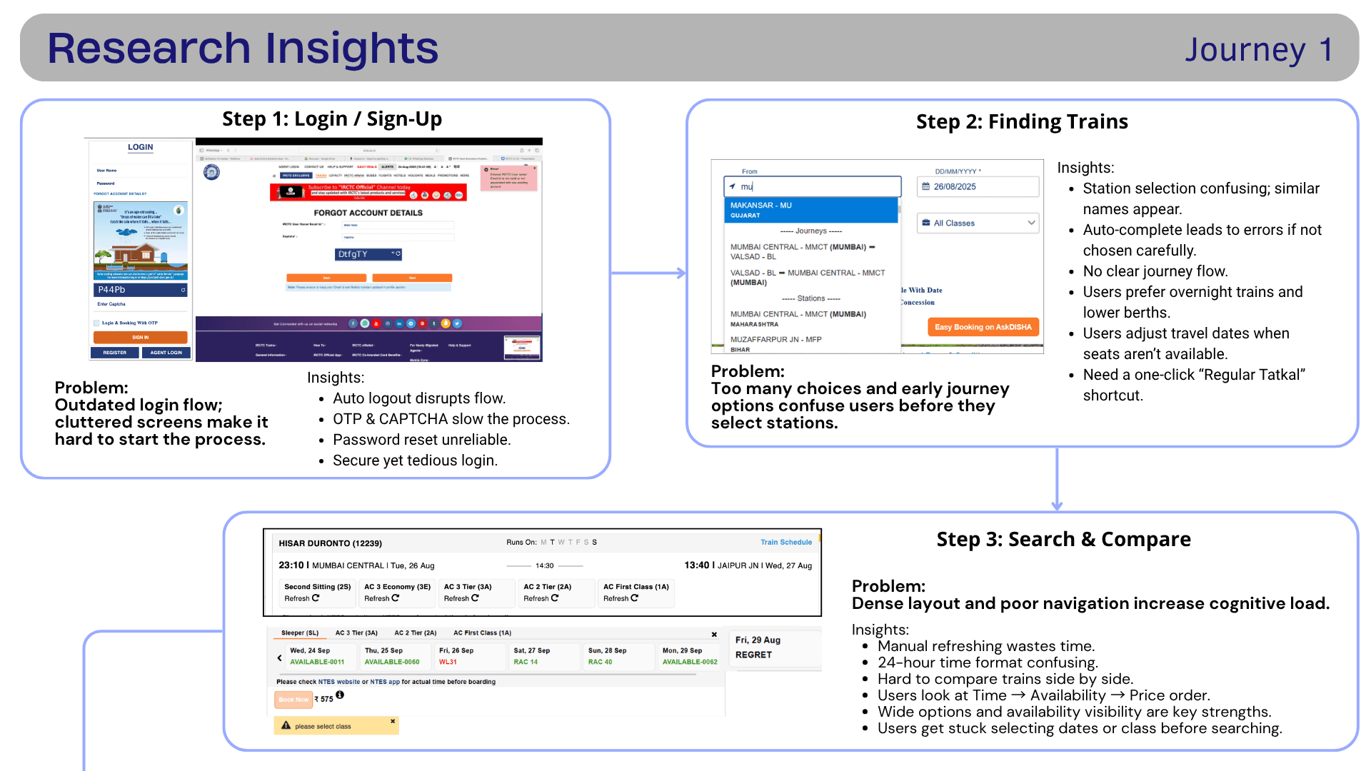
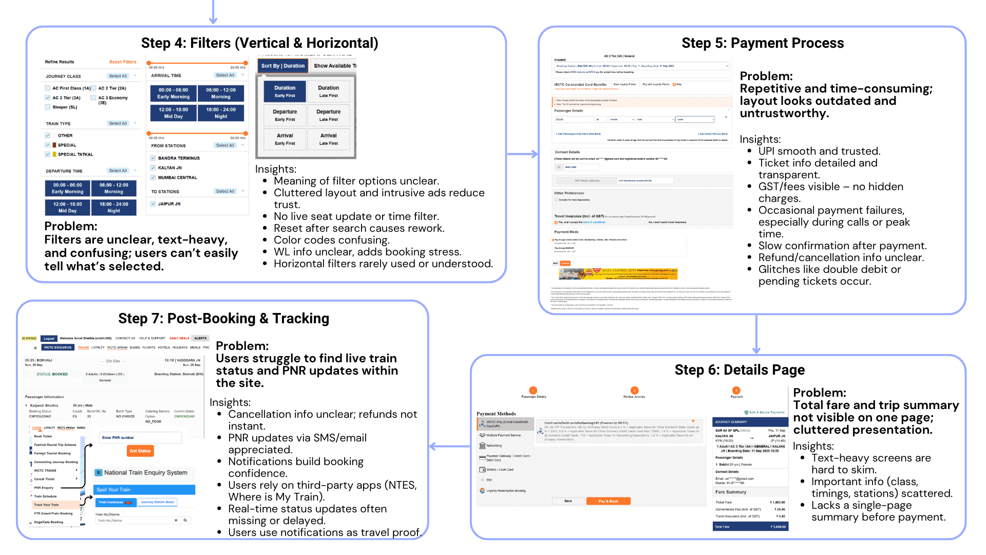
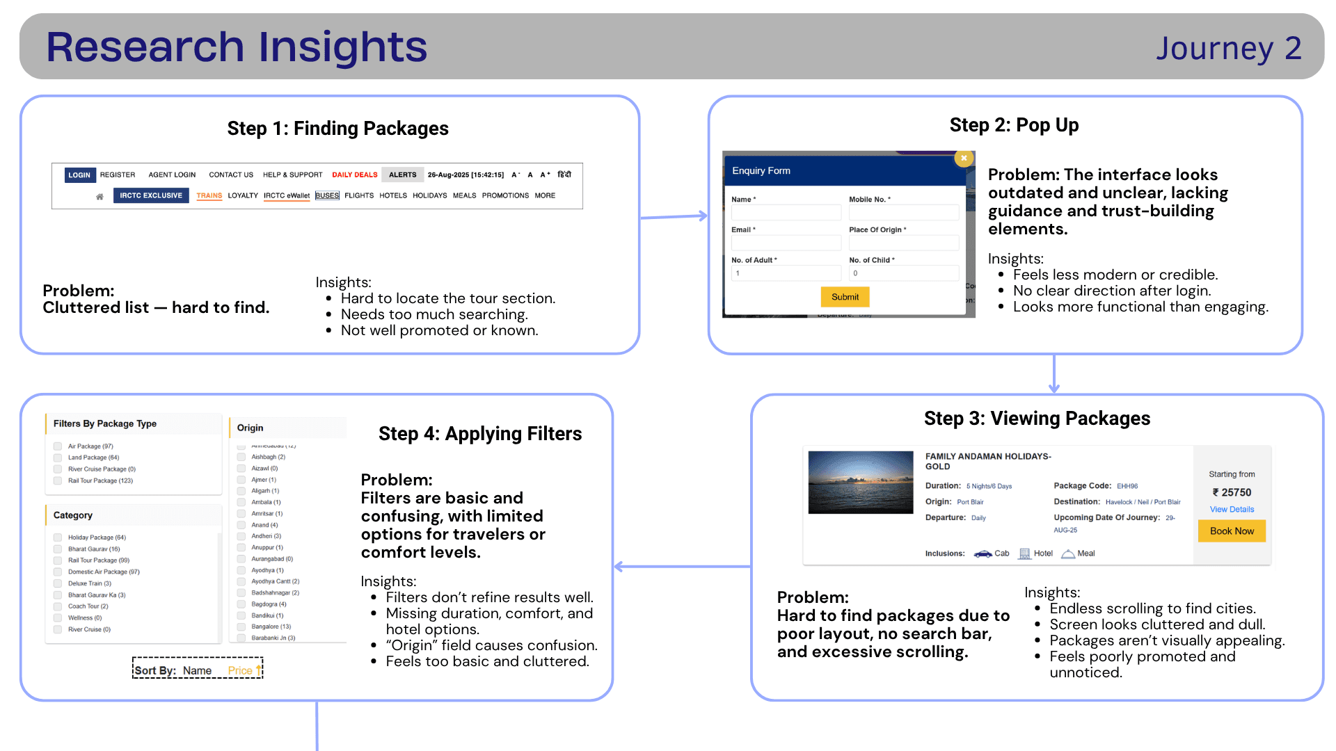
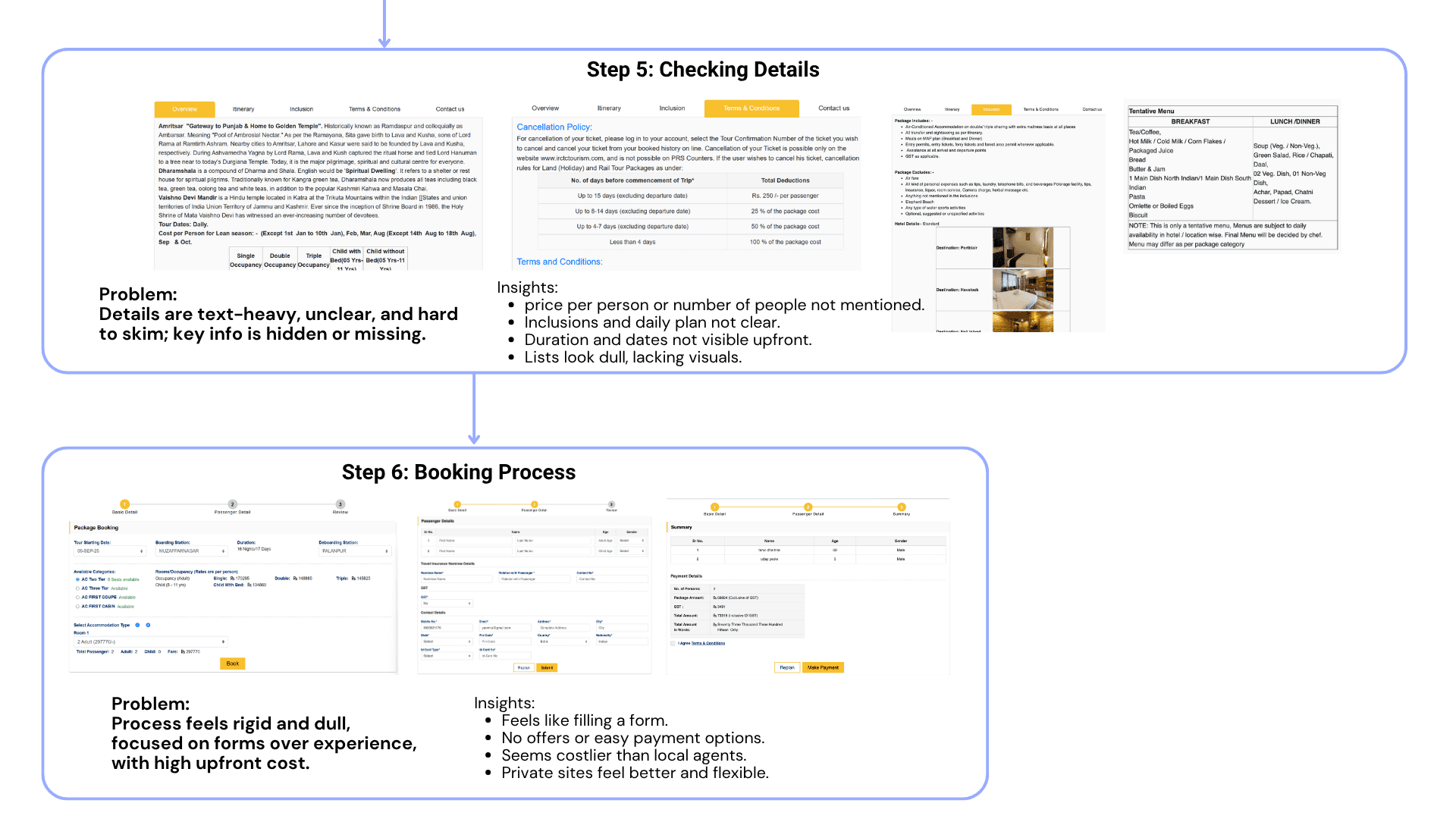
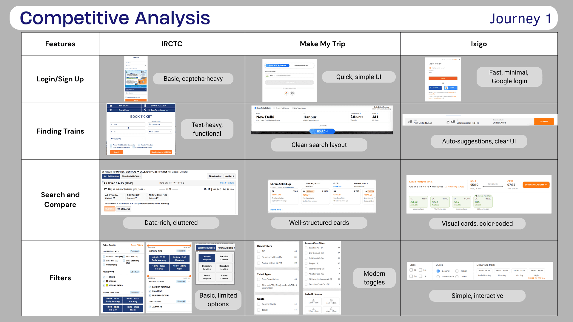
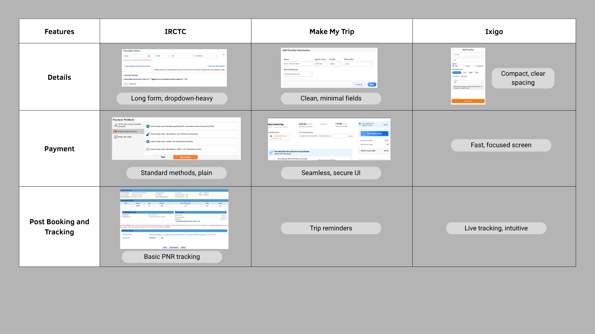
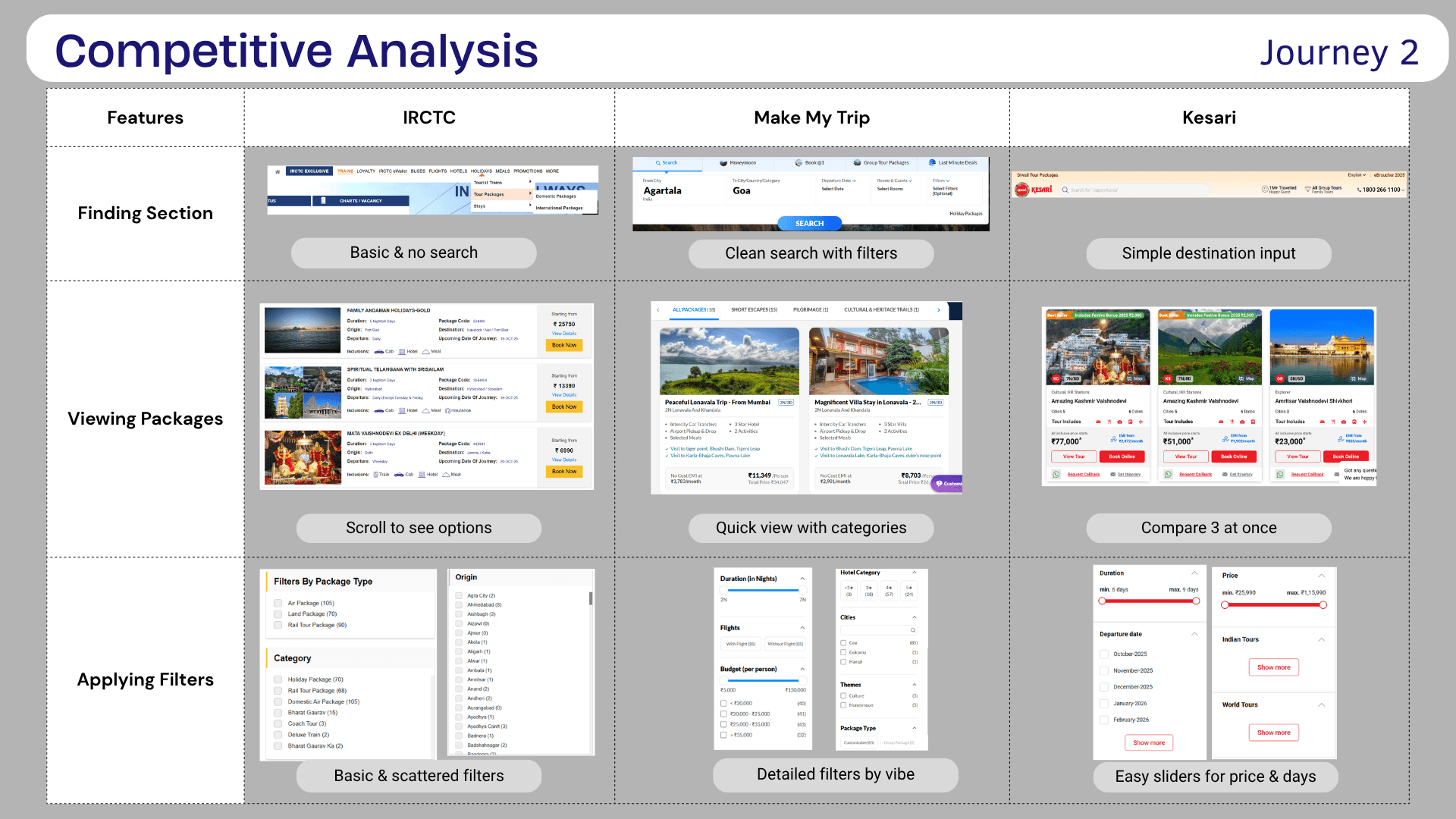
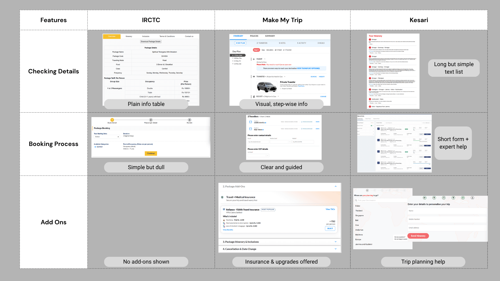
Competitive Analysis
Compared IRCTC with other travel platforms to understand differences .
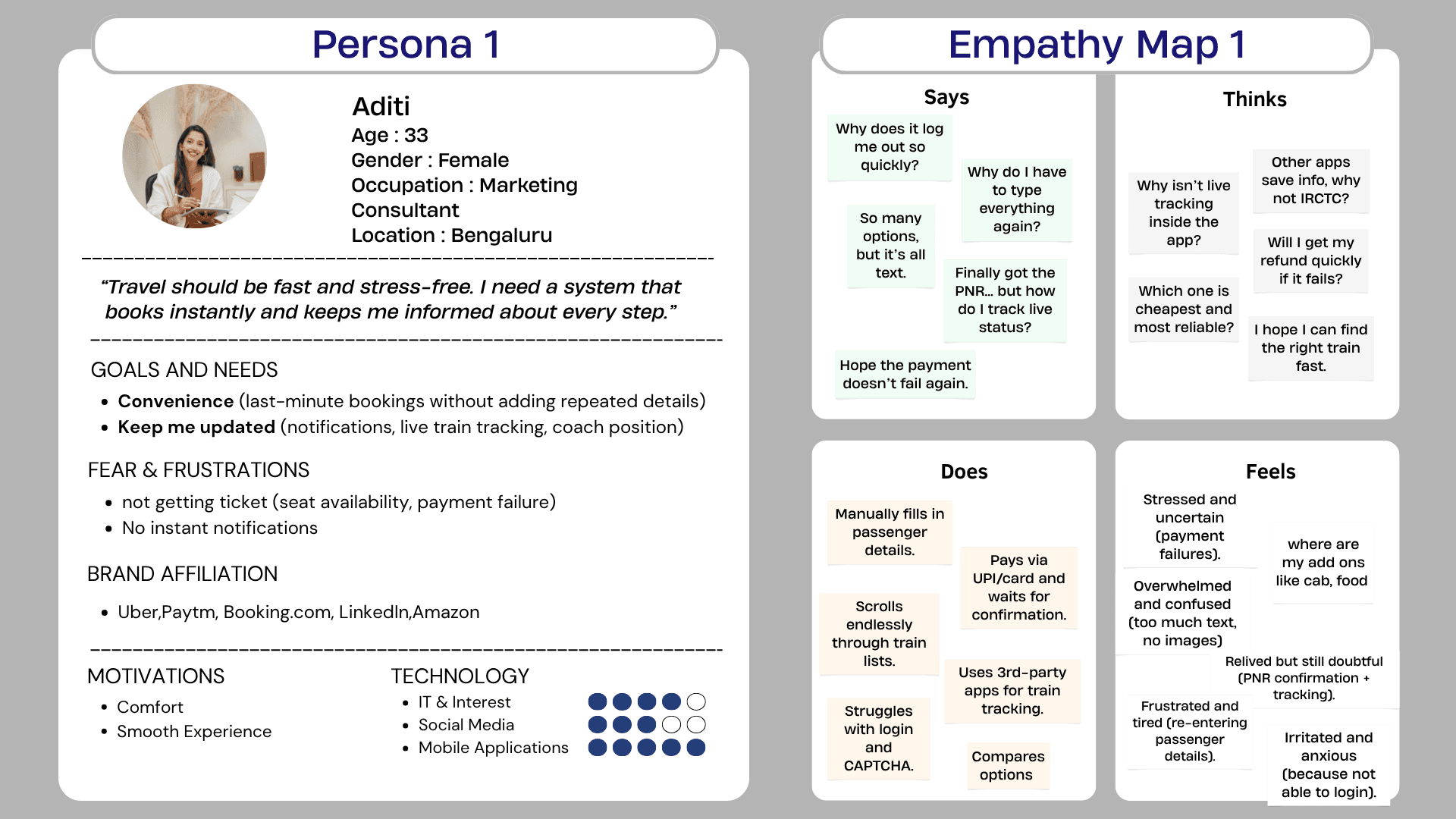
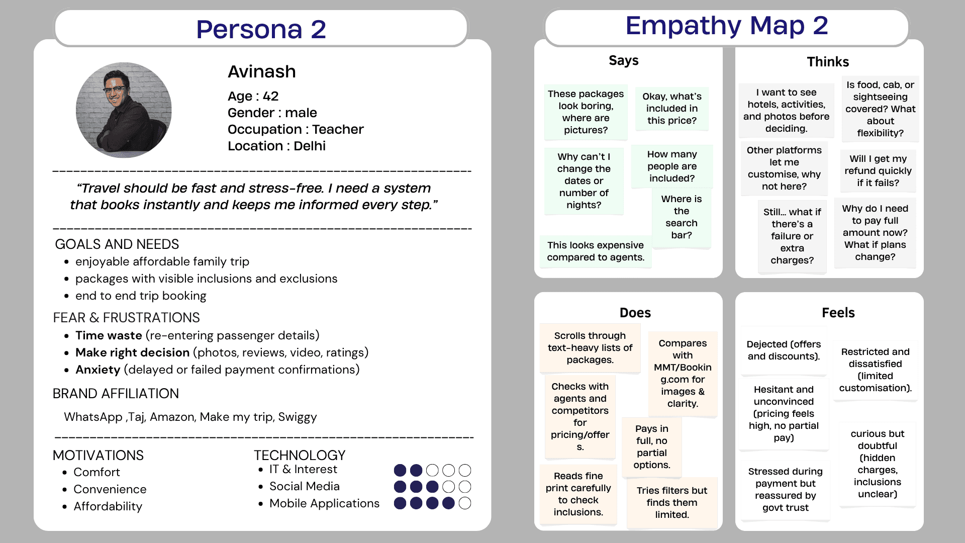
03 — DefinePersonas.
Empathy Mapping
The empathy maps helped connect interface problems with user emotions.
Users were not simply struggling to "use a website."
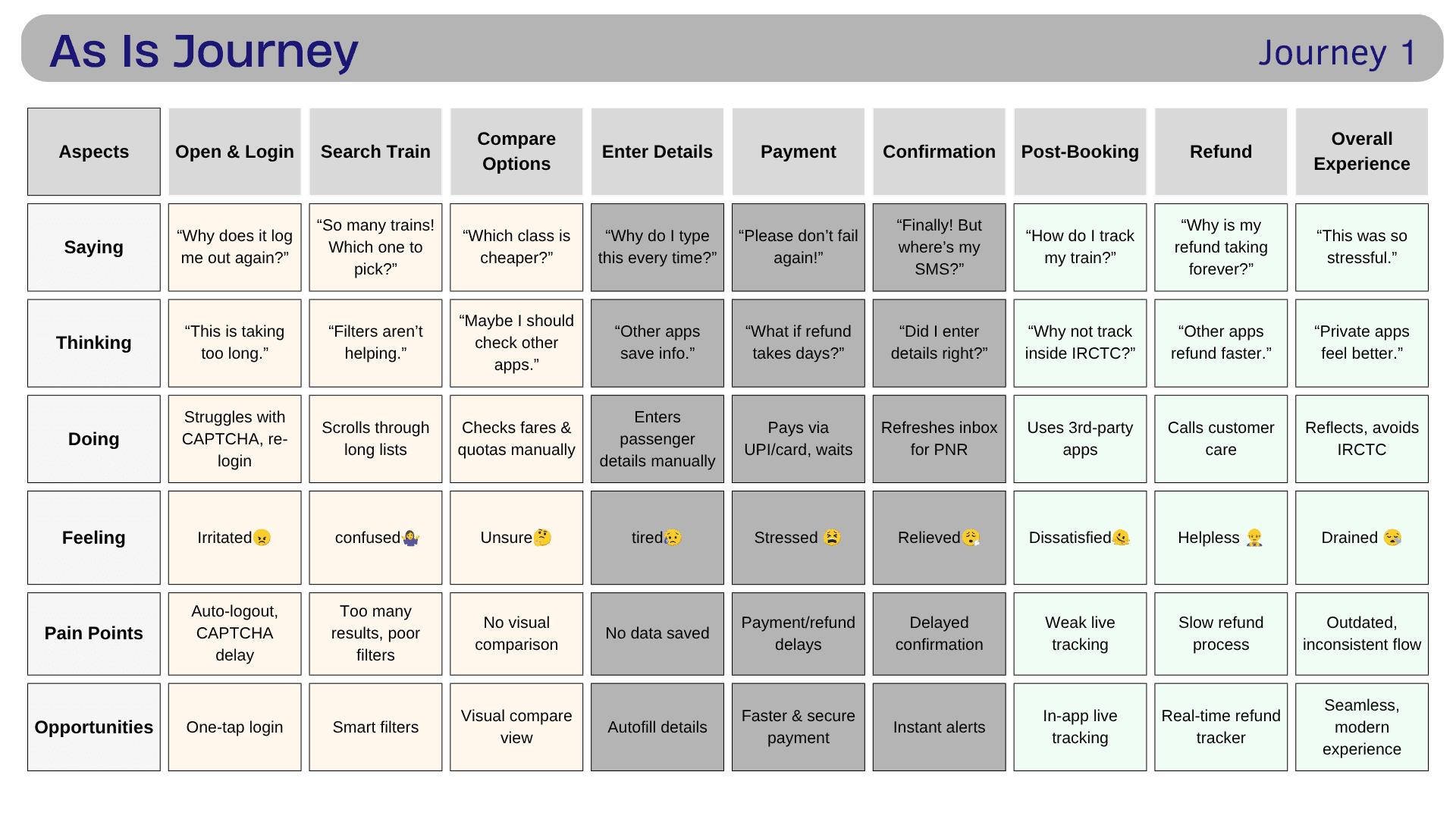
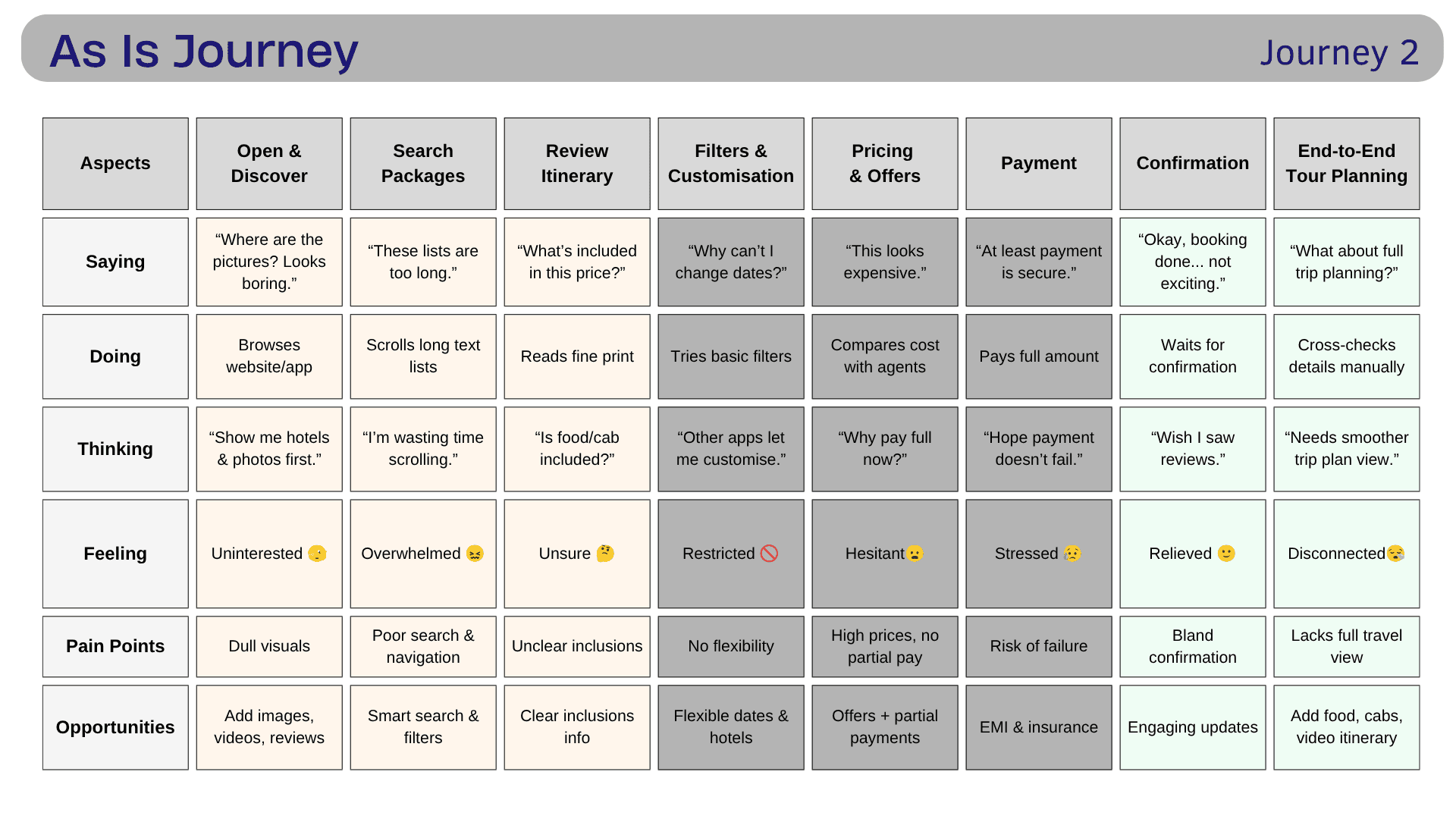
As-Is Journey Mapping
I mapped the current journey across:
Actions → Thoughts → Emotions → Pain Points → Opportunities
This made it easier to identify recurring problems across the experience.
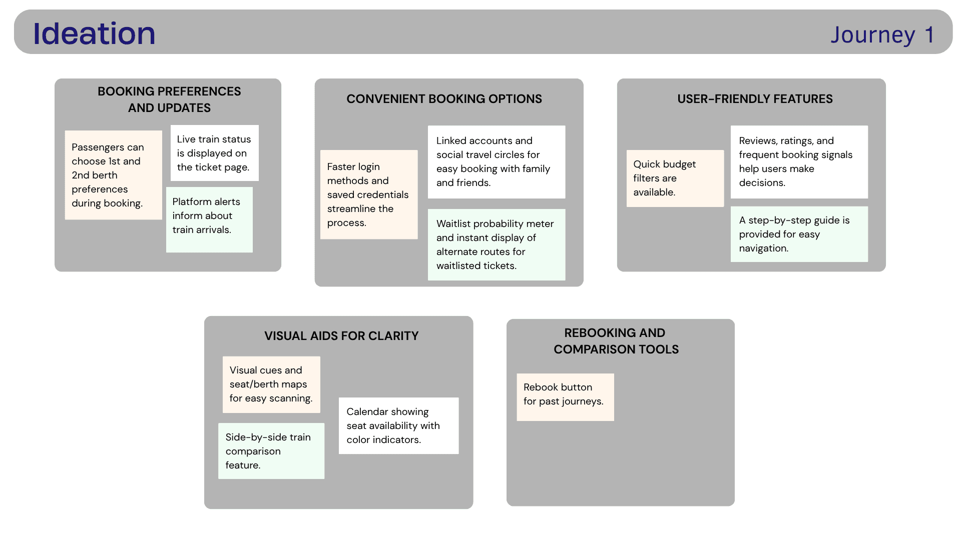
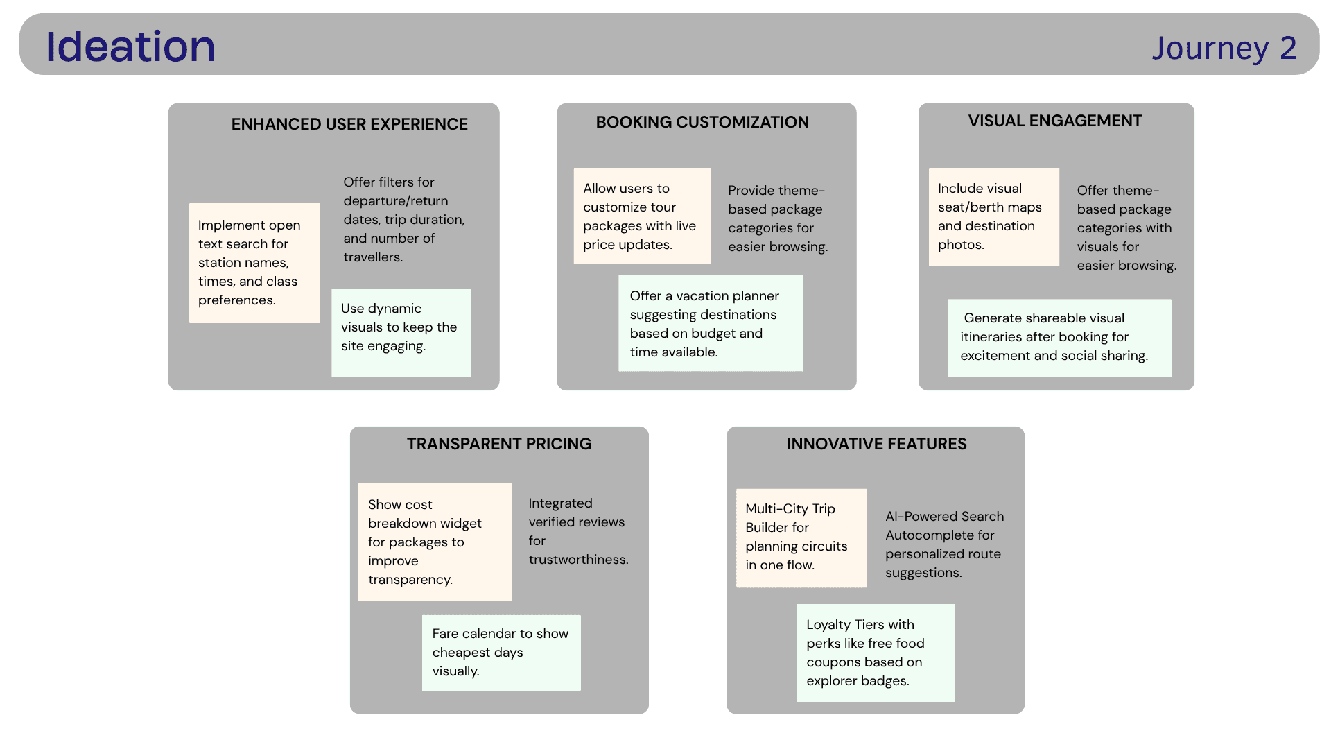
How Might We?
How might we redesign IRCTC to provide customers with a smooth, enjoyable experience and build brand loyalty?
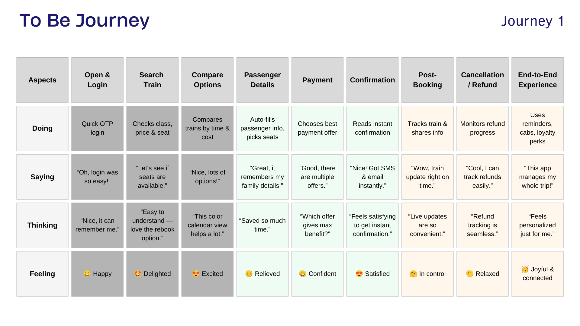
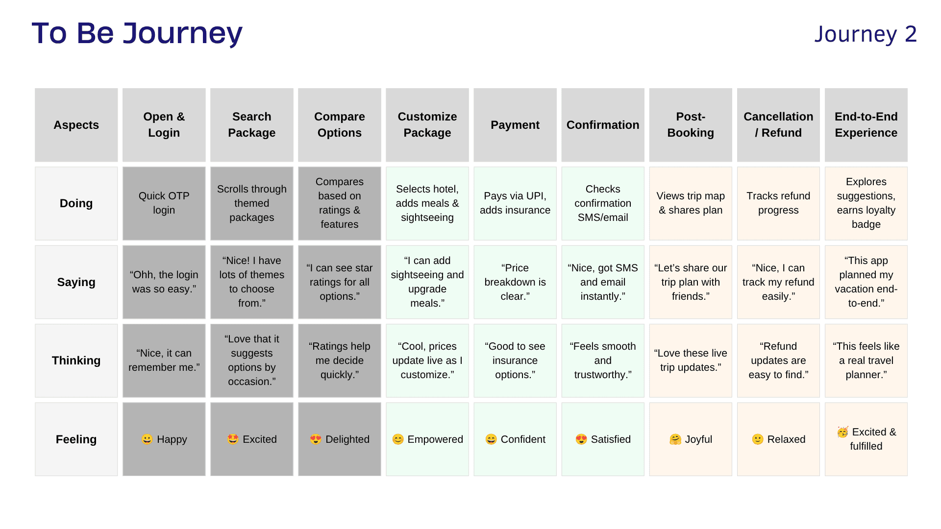
To-Be Journey
The redesigned journey aims to move the user from:
Confusion → Searching → Comparing → Deciding → Booking → Tracking → Managing
towards:
Confidence → Clarity → Control → Completion
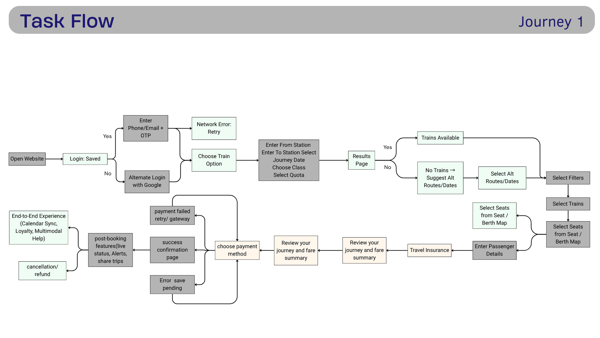
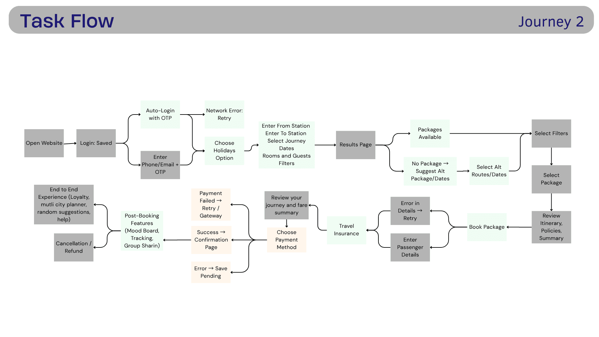
Task Flow
We converted the redesigned experience into task flows to understand how users would move through the system.
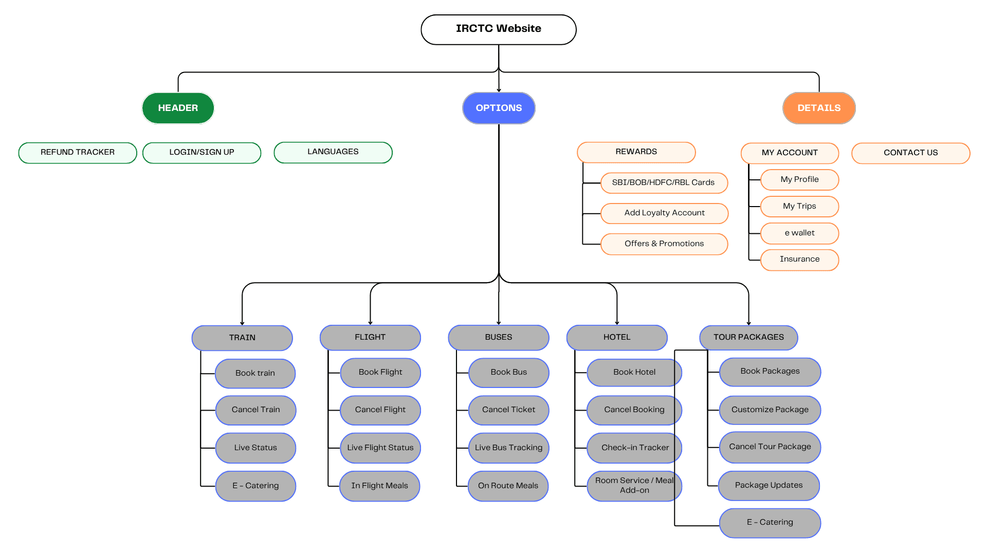
Information Architecture
The IA was developed around the user's mental model rather than IRCTC's existing service structure.
05 — Prototype & Test
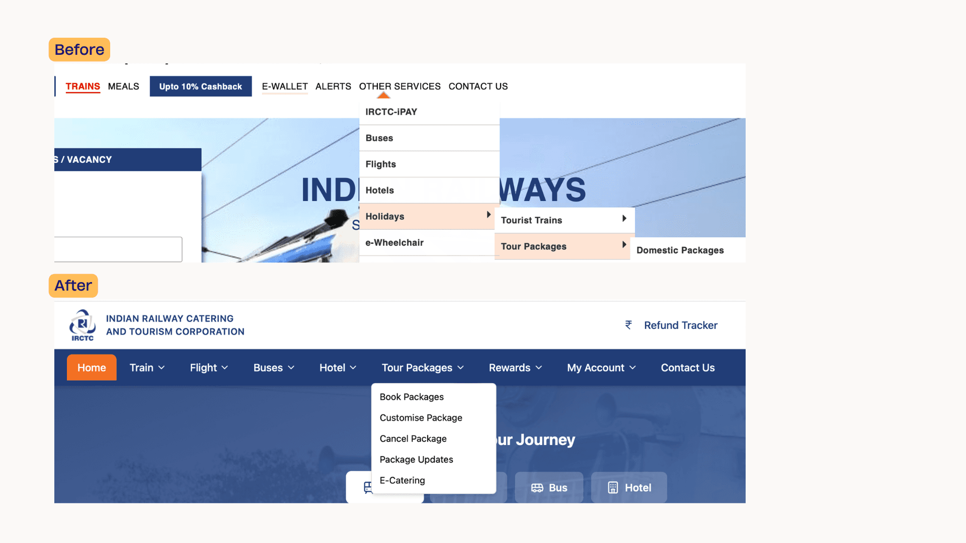
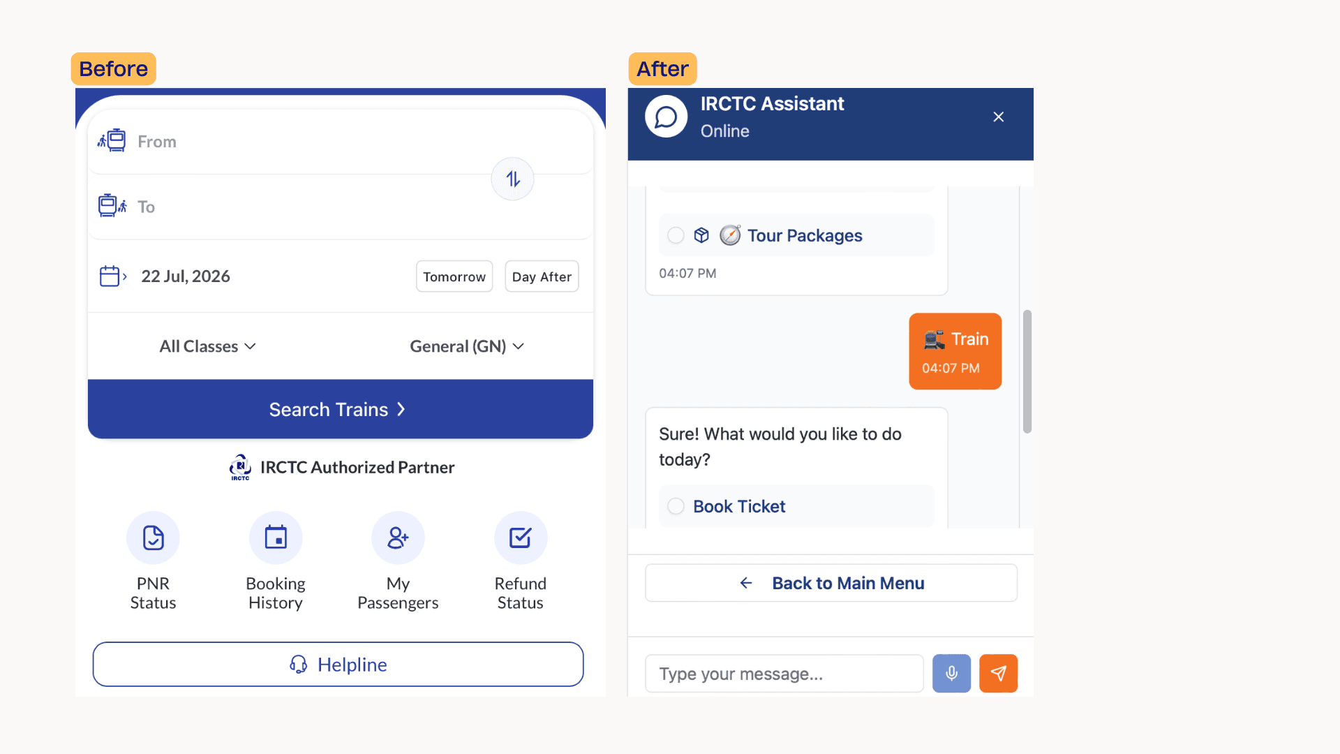
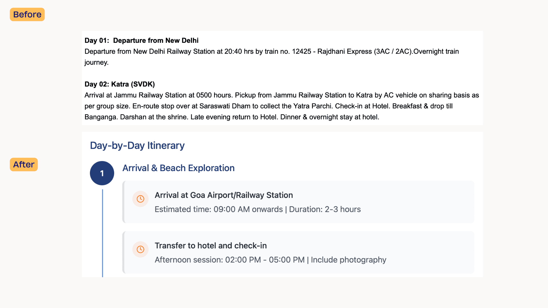
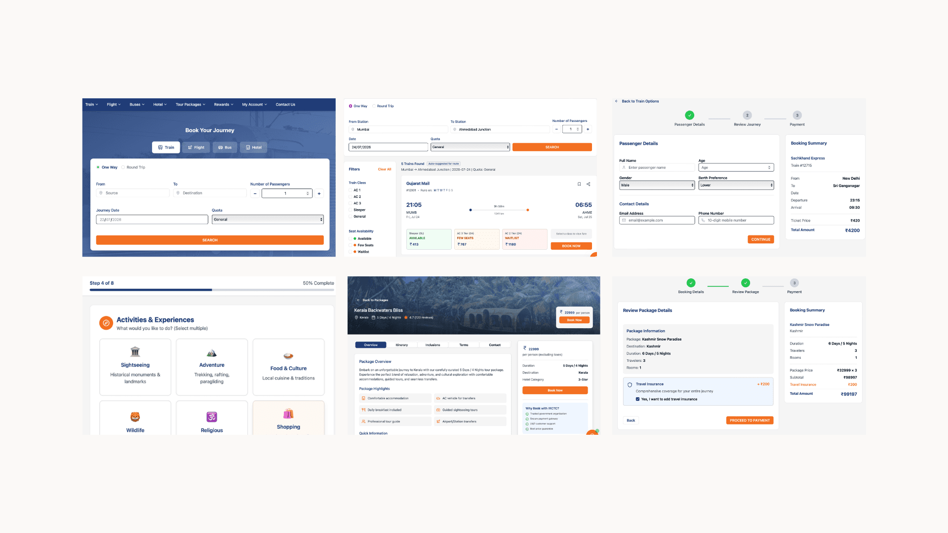
After defining the new flows, I developed the redesigned website experience and tested the key interactions.


Feedback
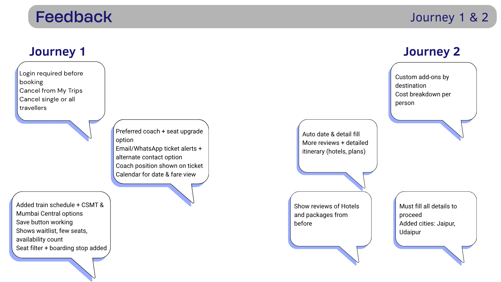
The feedback stage helped identify areas that still needed refinement.
Rather than treating testing as a final validation step, I used it to identify gaps in the proposed experience.
The key principle was:
Design → Test → Learn → Refine
Final Research Takeaways
01 — Complexity is not the same as functionality
IRCTC provides a large number of services, but exposing everything at once can increase cognitive load.
02 — Trust is a UX problem
Payment, refunds, confirmation and tracking strongly influence how users perceive the platform.
03 — Comparison is central to travel decisions
Users don't simply search for a train or package. They compare alternatives before committing.
04 — Information hierarchy matters
Users need the right information at the right moment, rather than all information at once.
05 — Post-booking is part of the experience
The journey does not end after payment. Tracking, alerts, cancellation and refunds are equally important.

What i Learned
This project changed the way I look at large digital platforms.
I learned that redesigning a complex product is not about making every screen look cleaner. The bigger challenge is understanding why users struggle, where those struggles occur, and which problems have the greatest impact on the overall journey.
Journey mapping helped me move from individual interface problems to system-level problems.
Competitive analysis taught me to look for patterns rather than simply copy competitors.
Personas and empathy maps helped translate research findings into user needs.
Most importantly, the project taught me to connect every design opportunity back to a research finding.
Key Learnings
Conducted UX research to identify usability issues and pain points in the existing IRCTC website.
Learned how to create user personas, empathy maps, and user journey maps to understand different traveler needs.
Improved my skills in competitive analysis by studying similar travel and ticket booking platforms.
Developed a strong understanding of information architecture, organizing complex booking flows into a clear and intuitive structure.
Strengthened my wireframing and high-fidelity UI design skills using Figma.
Learned to design responsive and consistent interfaces by building reusable components and maintaining a design system.
Improved my understanding of visual hierarchy, typography, spacing, and accessibility to enhance readability and usability.
Gained experience in simplifying complex booking and navigation flows, reducing user effort during ticket booking.
Enhanced my collaboration and iterative design skills by refining the interface based on feedback and usability principles.

