Works
Works
My Projects

POPO
POPO is a service concept designed to create meaningful interactions between people and animals by connecting different stakeholders involved in the experience. The project explored the complete ecosystem rather than designing a single application.
System Design
POPO
POPO is a service concept designed to create meaningful interactions between people and animals by connecting different stakeholders involved in the experience. The project explored the complete ecosystem rather than designing a single application.
System Design
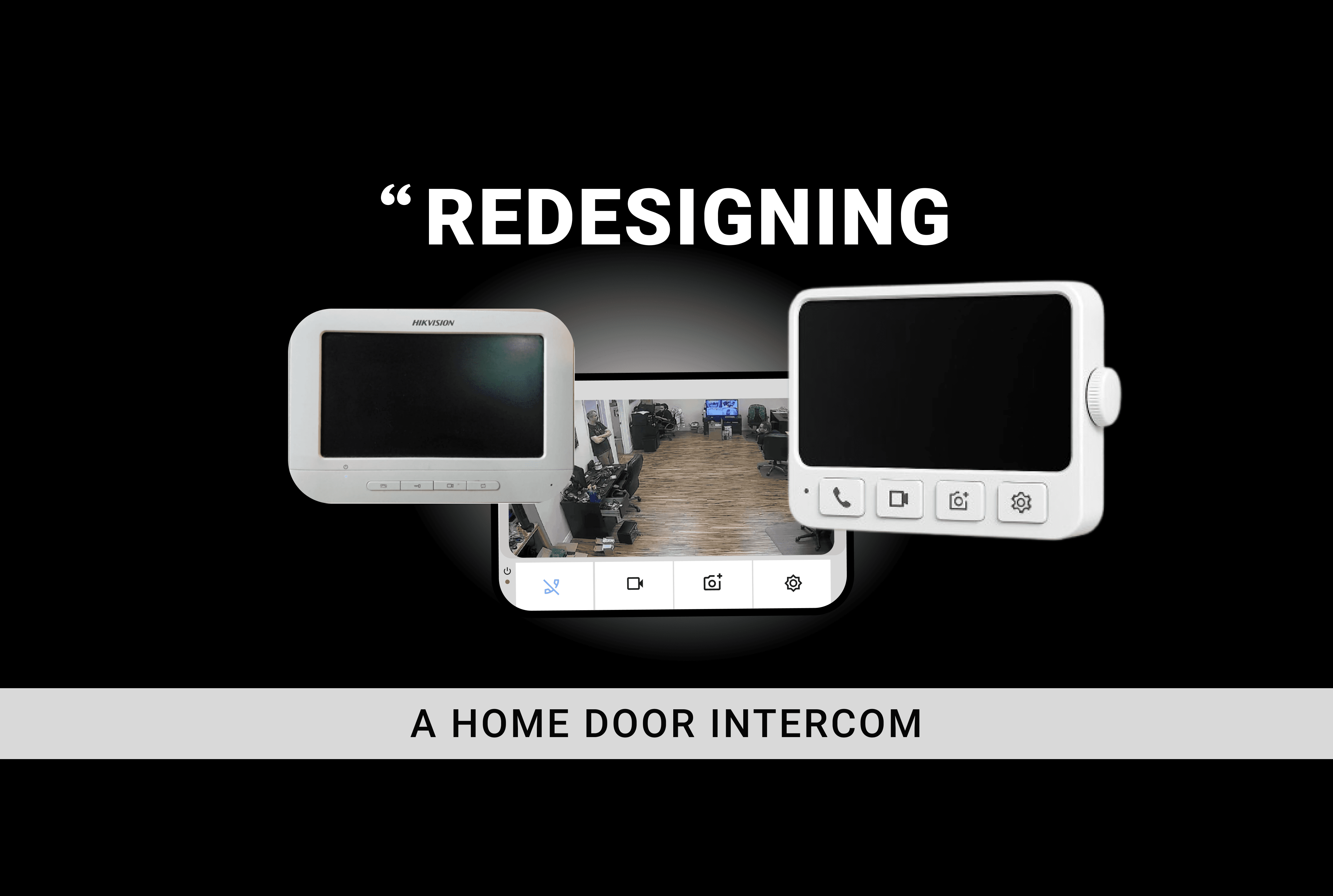
Door Intercome
Re-Designed the Hikvision DS-KIS204T analog video intercom system to make everyday home security more intuitive, accessible, and easier to use. The project focused on understanding how people interact with existing intercom systems and identifying opportunities to improve the experience for different users, particularly elderly users, students, working professionals, and multi-generational households. The redesign explored both the physical product interaction and the digital interface, with an emphasis on simplicity, clear feedback, and accessibility.
Phygital Design
Door Intercome
Re-Designed the Hikvision DS-KIS204T analog video intercom system to make everyday home security more intuitive, accessible, and easier to use. The project focused on understanding how people interact with existing intercom systems and identifying opportunities to improve the experience for different users, particularly elderly users, students, working professionals, and multi-generational households. The redesign explored both the physical product interaction and the digital interface, with an emphasis on simplicity, clear feedback, and accessibility.
Phygital Design

Edu-Mind
EduMind is an AI-powered school communication and learning platform designed to unify the fragmented experience of students, teachers, and parents into a single, intelligent app. Instead of juggling four or five different tools for attendance, messaging, assignments, and grades, EduMind brings everything into one role-based dashboard — built differently for each user so everyone sees exactly what they need. At its core, EduMind is three apps in one: A teacher dashboard that automates attendance, drafts parent replies, and tracks class emotional wellbeing A student space that gamifies learning with XP, streaks, and a personalised Smart Learn feed A parent portal that delivers calm, filtered updates instead of notification overload. Made using Claude.
UI/UX Design
Edu-Mind
EduMind is an AI-powered school communication and learning platform designed to unify the fragmented experience of students, teachers, and parents into a single, intelligent app. Instead of juggling four or five different tools for attendance, messaging, assignments, and grades, EduMind brings everything into one role-based dashboard — built differently for each user so everyone sees exactly what they need. At its core, EduMind is three apps in one: A teacher dashboard that automates attendance, drafts parent replies, and tracks class emotional wellbeing A student space that gamifies learning with XP, streaks, and a personalised Smart Learn feed A parent portal that delivers calm, filtered updates instead of notification overload. Made using Claude.
UI/UX Design

Pallatehatch
Pallatehatch is an interactive design assistant a website that helps you easily create professional color palettes and font combinations based on your project’s mood, type, or theme. Whether you're designing a website , or social media post, the tool offers smart suggestions using color theory, psychology, and curated font pairings so you can design with more confidence and less stress. You’ll also be able to preview your selections in real design layouts, learn why certain combinations work, and save your favorite palettes for future use. Made using Figma .
UI & UX Project
Pallatehatch
Pallatehatch is an interactive design assistant a website that helps you easily create professional color palettes and font combinations based on your project’s mood, type, or theme. Whether you're designing a website , or social media post, the tool offers smart suggestions using color theory, psychology, and curated font pairings so you can design with more confidence and less stress. You’ll also be able to preview your selections in real design layouts, learn why certain combinations work, and save your favorite palettes for future use. Made using Figma .
UI & UX Project

IRCTC
IRCTC is one of India's primary platforms for railway ticketing and travel-related services. While the platform provides a wide range of services, the existing experience can feel complex, information-heavy and difficult to navigate. This project explored the IRCTC experience from two major journeys: Journey 01 — Train Ticket Booking From login and train search to payment, confirmation, tracking and refunds. Journey 02 — Tour Package Booking From discovering packages to comparing options, understanding inclusions, booking and post-booking support.
UI/UX
IRCTC
IRCTC is one of India's primary platforms for railway ticketing and travel-related services. While the platform provides a wide range of services, the existing experience can feel complex, information-heavy and difficult to navigate. This project explored the IRCTC experience from two major journeys: Journey 01 — Train Ticket Booking From login and train search to payment, confirmation, tracking and refunds. Journey 02 — Tour Package Booking From discovering packages to comparing options, understanding inclusions, booking and post-booking support.
UI/UX

CityKhoj
CityKhoj is a revolutionary mobile application designed to transform how users explore their surroundings. By offering personalized recommendations based on mood, budget, and time, it eliminates the hassle of juggling multiple apps. Users can effortlessly discover hidden gems, local eateries, and exciting events, all tailored to their preferences. With CityKhoj, the city becomes a playground, inviting users to explore and experience it like never before. Join us on this journey of urban discovery! Made in Figma.
UI/UX Design
CityKhoj
CityKhoj is a revolutionary mobile application designed to transform how users explore their surroundings. By offering personalized recommendations based on mood, budget, and time, it eliminates the hassle of juggling multiple apps. Users can effortlessly discover hidden gems, local eateries, and exciting events, all tailored to their preferences. With CityKhoj, the city becomes a playground, inviting users to explore and experience it like never before. Join us on this journey of urban discovery! Made in Figma.
UI/UX Design
Ready to build something amazing?
I'd love to connect with you!
Ready to build something amazing?
I'd love to connect with you!
Ready to build something amazing?
I'd love to connect with you!