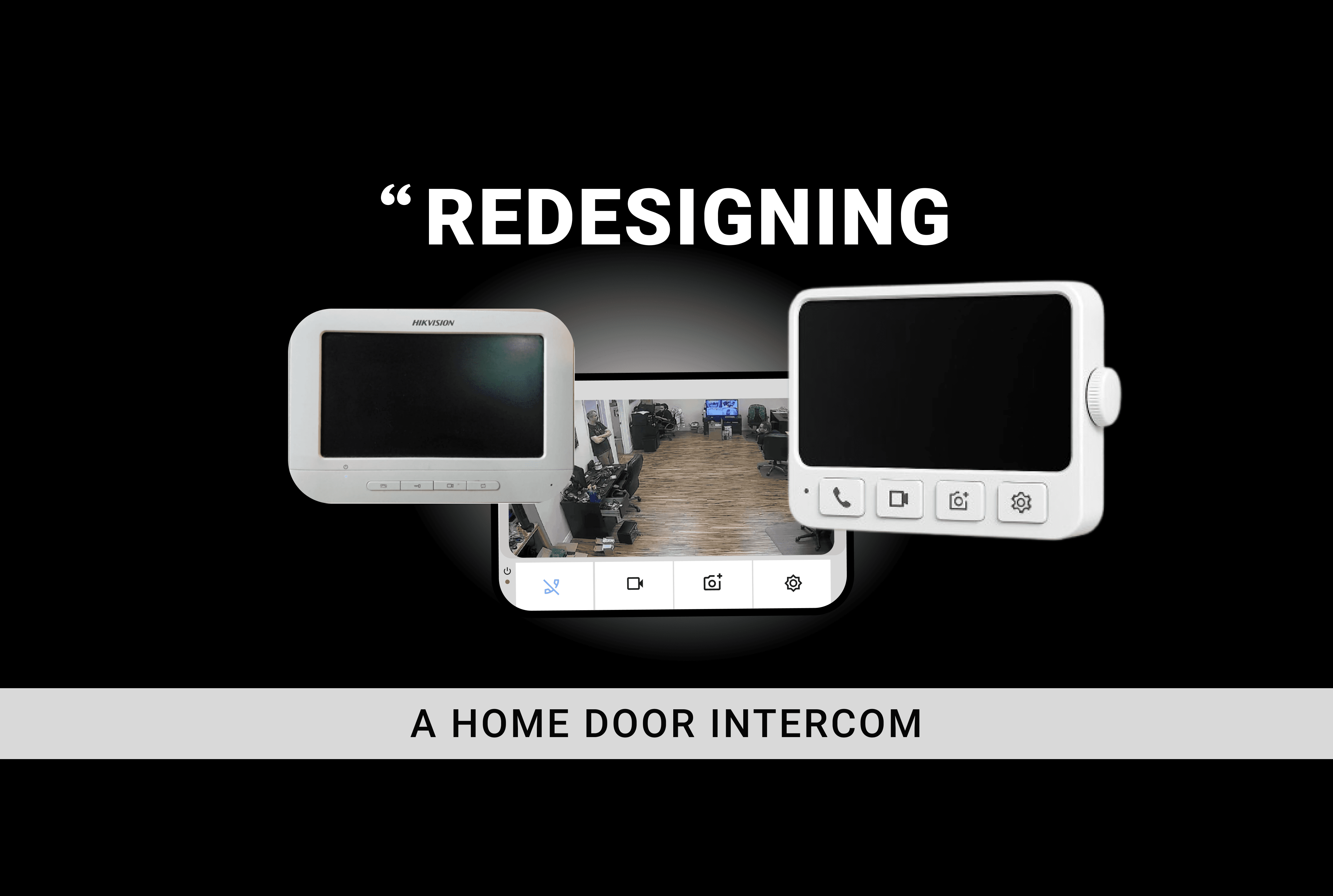
Re-Designed the Hikvision DS-KIS204T analog video intercom system to make everyday home security more intuitive, accessible, and easier to use.
The project focused on understanding how people interact with existing intercom systems and identifying opportunities to improve the experience for different users, particularly elderly users, students, working professionals, and multi-generational households.
The redesign explored both the physical product interaction and the digital interface, with an emphasis on simplicity, clear feedback, and accessibility.
Phygital Design
Project Overview
Research Strategy
We followed an iterative research and design process:
The goal was not simply to make the intercom look modern.
We wanted to understand:
What prevents users from confidently operating the device?
and
How can the physical and digital interactions be redesigned to make the system easier to understand across generations?
Research Objectives
Our research focused on five objectives:
01 — Identify pain points
Understand where users struggle with the existing interface.
02 — Understand behaviour
Observe how people naturally approach and interact with an intercom.
03 — Test interaction concepts
Evaluate proposed features such as Bluetooth, scroll navigation and physical buttons.
04 — Measure intuitiveness
Understand whether users can predict what an icon or control will do without instruction.
05 — Improve accessibility
Explore how the interface could work for multi-generational households.
Understanding the Existing System: Began by studying the existing Hikvision analog intercom and understanding its current functionality.
Understanding Users
User Research: Conducted interviews and usability research to understand how people actually interact with home intercom systems.
Focused on students, elderly users, and working adults to understand differences in their needs and expectations.
INFORMATION ARCHITECT
USER-FLOW
STORY-BUILDING
Created storyboards to understand the experience around a typical visitor interaction
.Mapping this experience helped me identify moments where users could become confused or need additional feedback.
Exploring the Solution
Translated the research findings into early concepts using paper wireframes and prototype walkthroughs.
Rather than immediately designing the final interface, First explored the structure and interaction of the system.
The goal was to simplify the experience while retaining the essential functions of the original intercom.
USEBILITY- TESTING
I tested the redesigned concept with students, elderly users, and working adults.
Participants were asked to complete realistic tasks such as:
Answering a doorbell call
Adjusting brightness and volume
Capturing an image of a visitor
Viewing saved images in the gallery
Trying the Bluetooth export feature
I monitored task completion and collected think-aloud feedback to identify points of confusion and areas that felt intuitive.
WHAT I LEARNED FROM TESTING
Testing revealed that some of my initial design decisions still needed refinement.
WHAT WORKED
Most icons were understandable.
Settings such as brightness and volume were useful.
The simple interface was appreciated.
The capture feature was useful.
The gallery was valuable for storing visitor images.
WHAT DIDN'T WORK
Call and Capture icons were initially confused.
The scroll wheel was not immediately understood.
Some users expected touch interaction.
Brightness and volume controls were difficult to discover.
The Bluetooth function raised security concerns.
Users were unsure about microphone activation.
These findings helped me move from simply designing what looked intuitive to designing what users could actually understand and operate.
Prioritizing the Improvement
Research Impact
The research changed several important design decisions.
Research finding
Design response
Call/Capture confusion
Clearer icons + labels
Scroll wheel misunderstood
Simpler navigation controls
Mic state unclear
Visual/audio feedback
Alerts caused stress
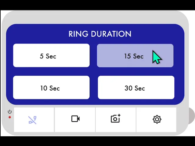
Volume + ring-duration controls
Users wanted visitor history
Gallery + capture
Bluetooth raised security concerns
Export confirmation/restrictions
Elderly users preferred simplicity
Larger controls + simpler interaction
Brightness/volume controls were difficult to find
More visible settings
FINAL UI SCREENS
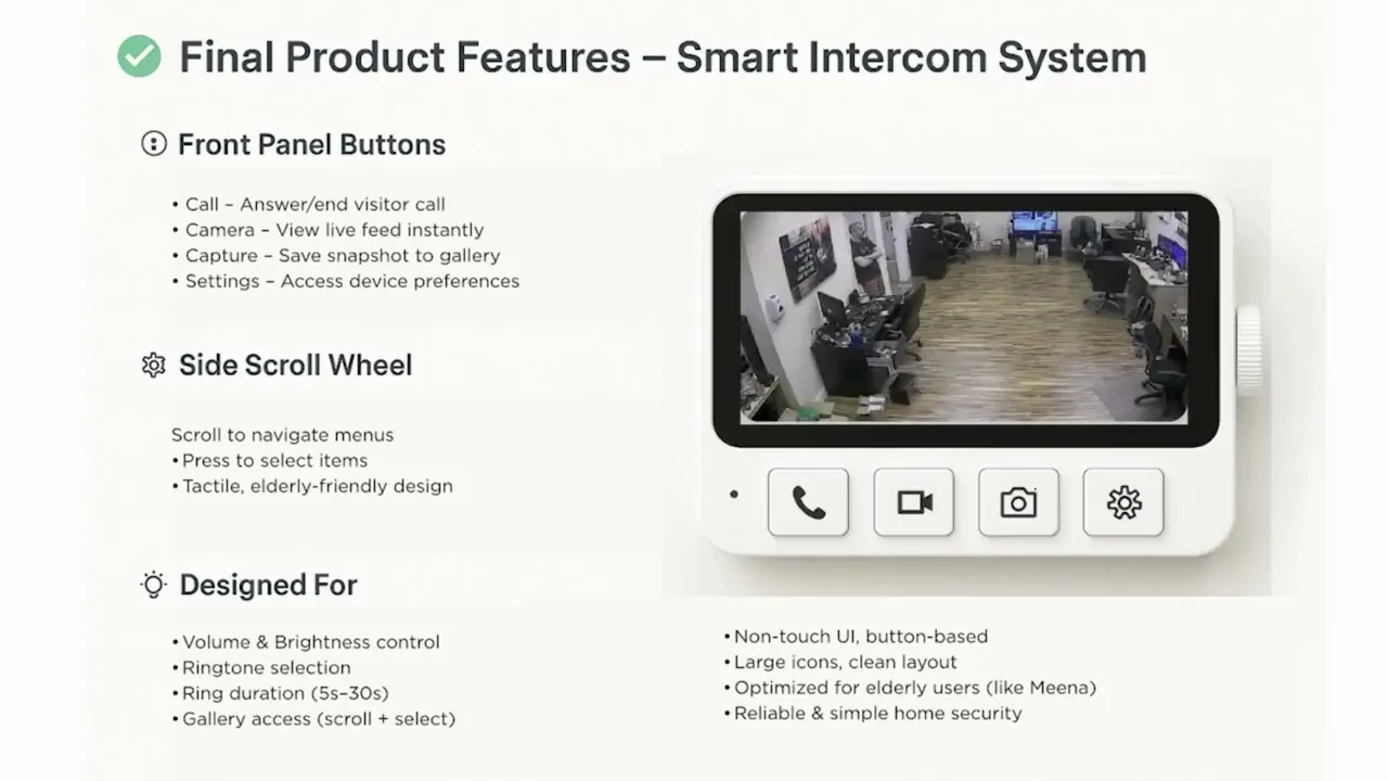
The redesign brings together physical product design, interaction design, and interface design into one system.
Instead of adding technology simply for the sake of making the product "smart," I focused on improving the interactions that users perform most frequently.
The result is a home intercom concept that aims to be:
Simple. Accessible. Reliable. Easy to understand.
My Contribution
I contributed to the project through UX research, Information Architecture, and User Flow development. I conducted usability testing to identify interaction issues and translate user feedback into improvements. I also designed the key UI screens, ensuring the final interface was clear, accessible, and aligned with the research findings.
Project Takeaway
This project taught me that good UX research is not simply about asking users what they want.
It is about observing what they expect, understand, misunderstand and do—especially when the interface is used in a high-pressure situation.
The intercom redesign showed me how small interaction problems, such as an unclear icon or misunderstood control, can have a significant impact when the product is responsible for something as important as home security.
My biggest takeaway:
Design for the user's mental model, not the designer's intention.