I identified a problem in how designers discover, evaluate and work with colour, researched existing solutions, and designed PaletteHatch as a response to those gaps.
PALLATEHATCH
Understanding how designers choose, evaluate and work with colour
Personal Project
Role: UX Researcher + UX/UI Designer
Focus: User Research · Secondary Research · Competitive Analysis · User Needs · User Flows · Prototyping
THE PROBLEM
Existing colour tools often help users generate colours, but the process of actually deciding whether a palette works for a design can become fragmented.
A designer may need to move between different tools to:
Find colours → Check combinations → Test contrast → Apply colours → Evaluate → Adjust
This creates an opportunity for a more connected colour-selection experience.
My initial hypothesis
Designers need more than colour generation; they need help understanding how colours work together in a real design context.

PRIMARY RESEARCH
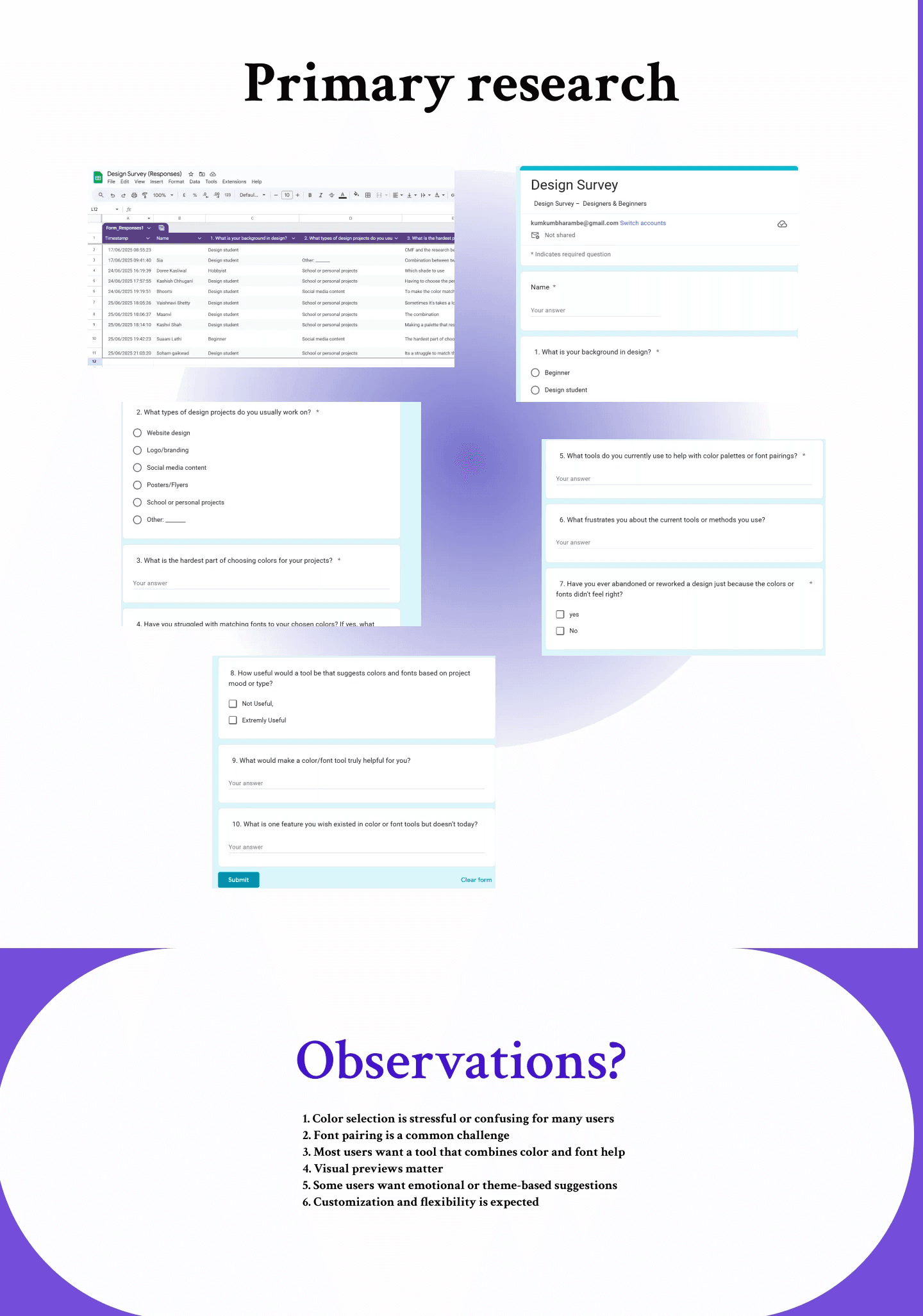
I conducted primary research to understand how people approach colour selection and what they expect from colour-related tools.
The research was structured around actual behaviour rather than simply asking:
“Do you like this website?”
Instead, I focused on understanding:
What people do → Why they do it → Where they struggle → What they need
SECONDARY RESEARCH
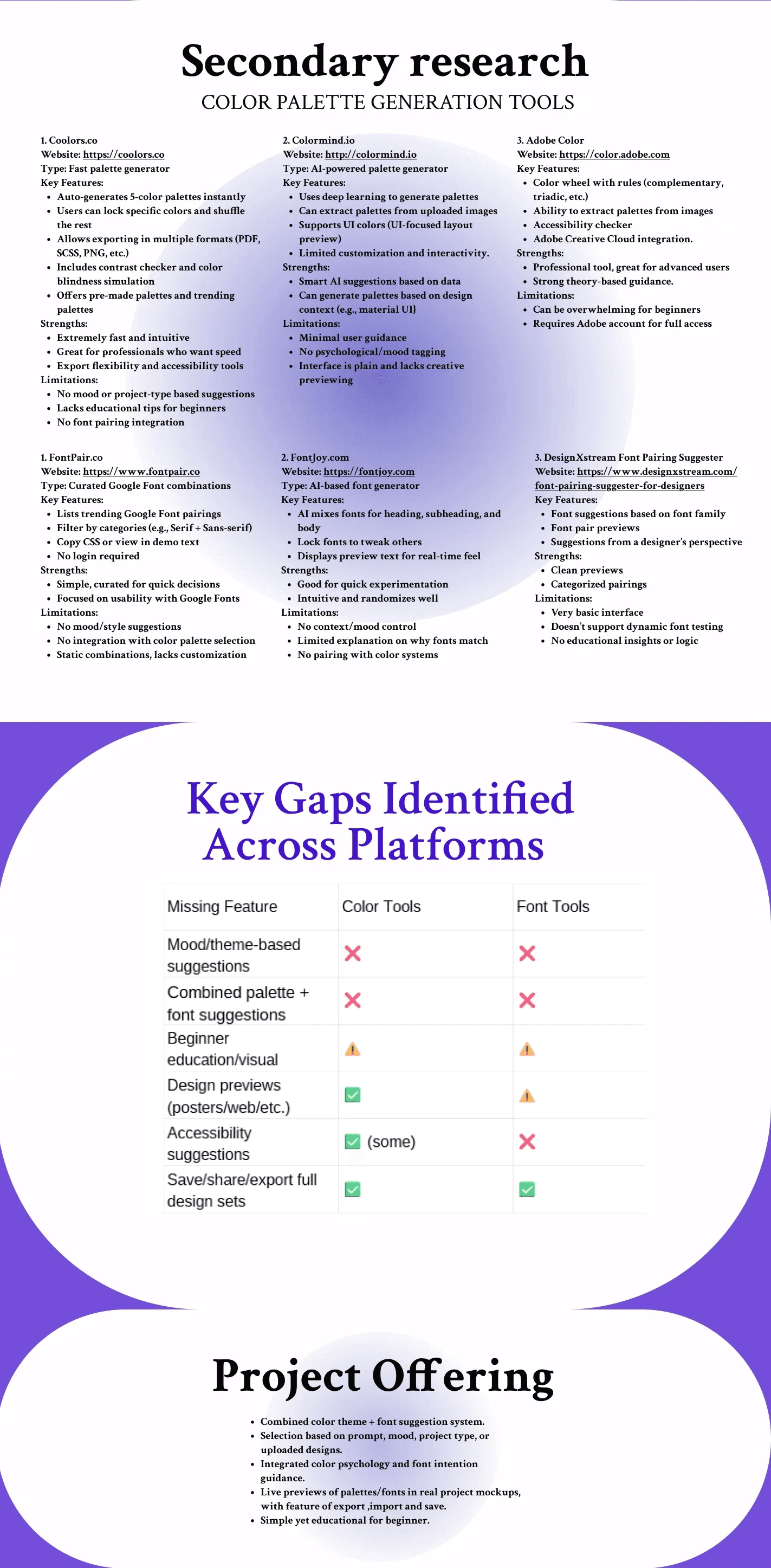
I then studied existing colour and design platforms to understand the current landscape.
The goal was to answer:
What already exists, and where are the gaps?
PROJECT OPPORTUNITY
PaletteHatch
PaletteHatch was proposed as a colour exploration platform that brings the different stages of colour decision-making into one experience.
The concept
Discover → Explore → Test → Compare → Apply
THE RESEARCH INSIGHT
The important shift
My research changed the problem from:
“How can I help users generate better colour palettes?”
to:
“How can I help users confidently choose, evaluate and apply colour palettes?”
That distinction became the foundation for PaletteHatch.
USER FLOW

IA
MOODBOARD
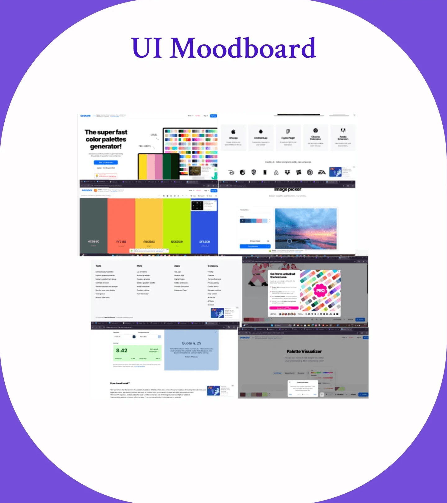
UI SCREENS
My Role
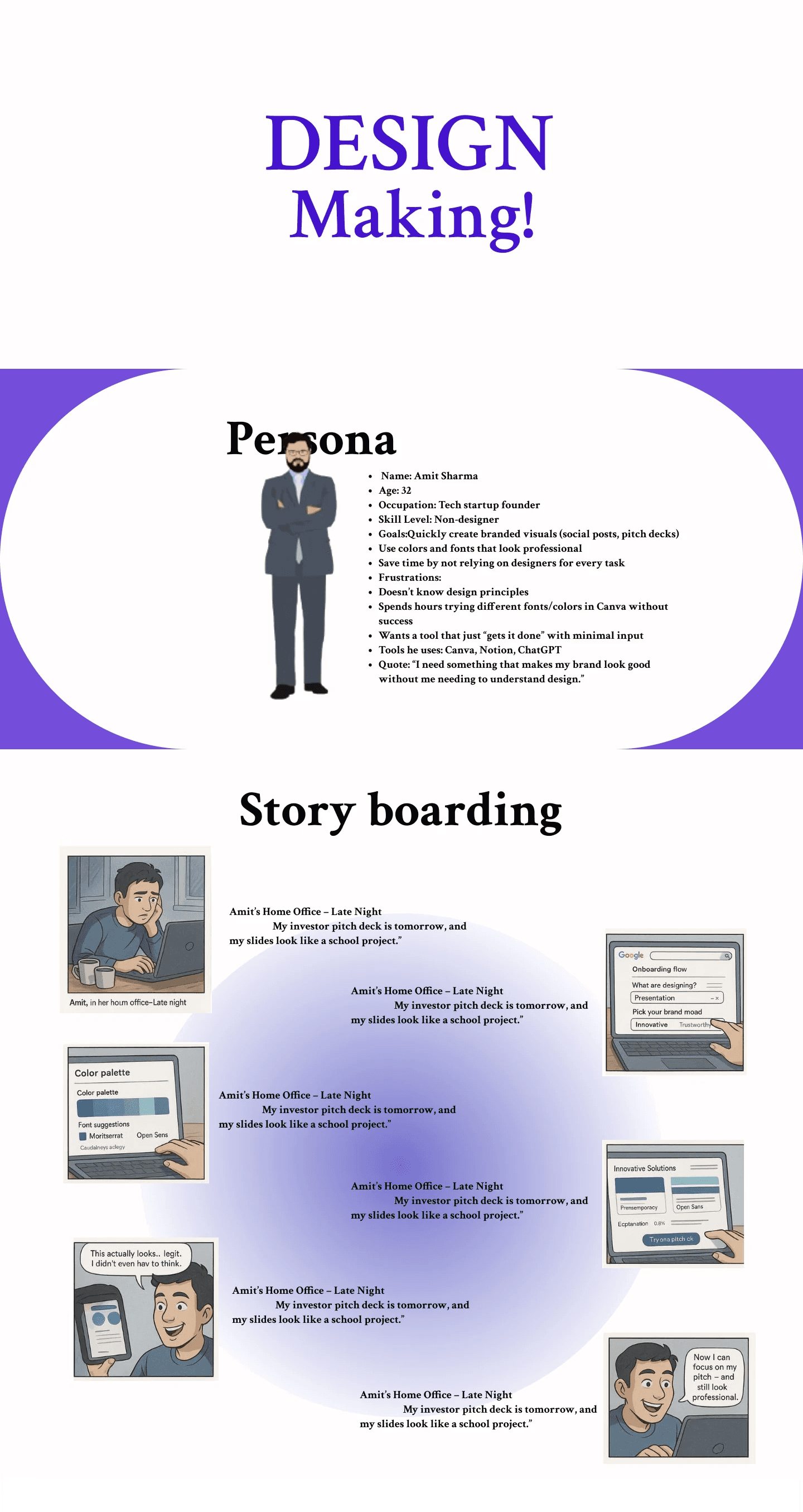
I independently drove the project from research to final design, including primary and secondary research, competitive analysis, synthesis of user needs, persona development, storyboarding, user flows, information architecture, prototyping, and UI design.
LEARNINGS
This project taught me that good design starts with understanding the problem, not designing the interface.
Through primary and secondary research, I learned how important it is to question assumptions and validate them with real users. Comparing existing platforms also helped me understand that identifying a gap is not just about finding missing features it is about finding where the existing experience fails to meet user needs.
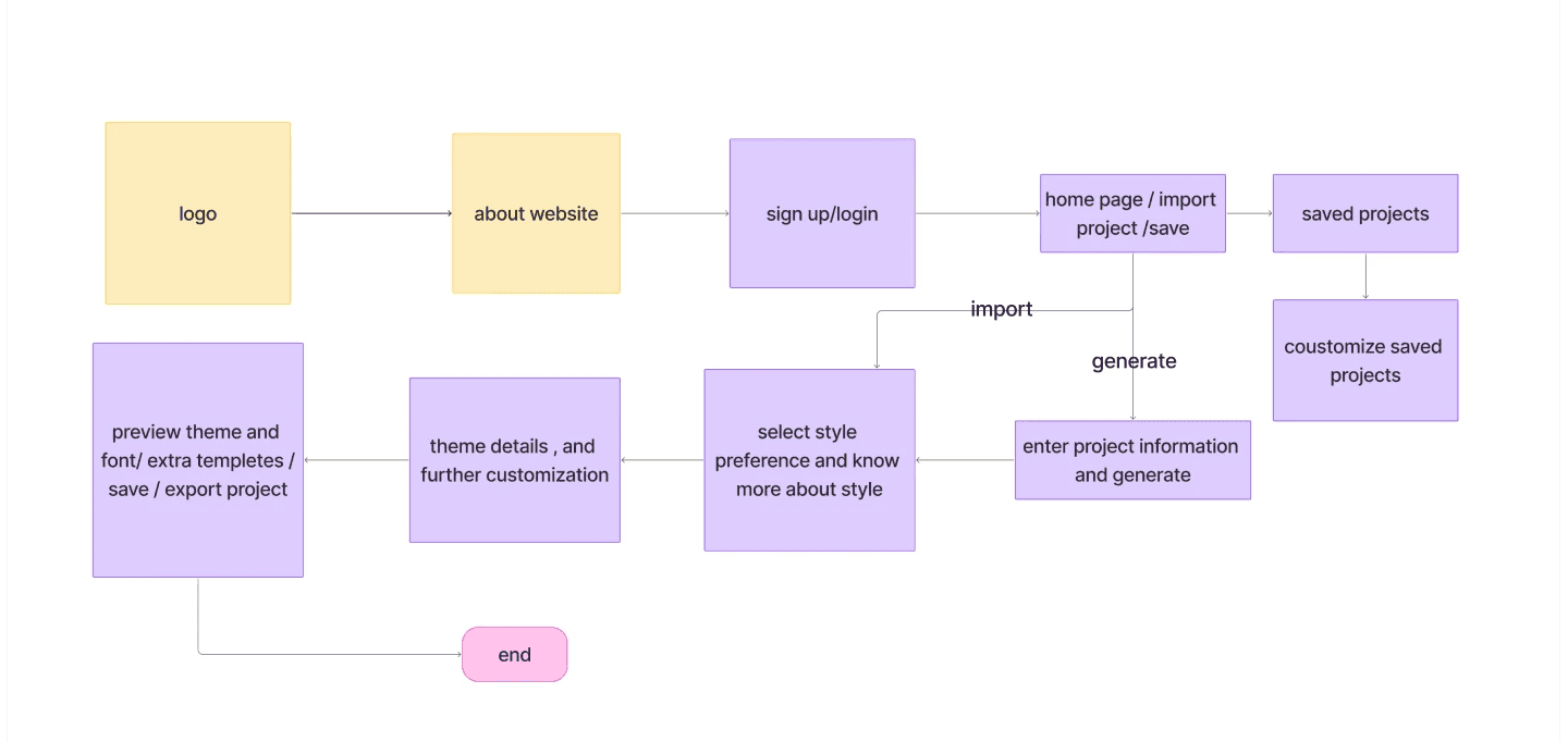
I also learned how research → insights → user flow → interface creates a much more meaningful design process. Creating personas, storyboards, and user flows helped me think about the experience from the user's perspective before making visual decisions.
Most importantly, the project helped me understand how to turn research findings into actionable design decisions.

